Sawyer logo guidelines
We prefer to use the Sawyer logo with our Sawyer “poppy” red color. This could be our primary poppy red logo on a white (or another very light color) background, or our primary white logo on a poppy red background.
Clear space and placement
When placing our logo, ensure there is adequate space between the logo and any surrounding elements. As demonstrated below, the Sawyer logo should retain a minimum clear space equal to the width of its letter “w”.
Do not place the Sawyer logo next to or combine it with logos, text, or imagery in a way that implies unapproved endorsement, partnership, attribution, or association. If you are a Sawyer customer, provider, partner, or investor and would like to lock up a Sawyer logo with your own logo, please refer to our partnership guidelines.
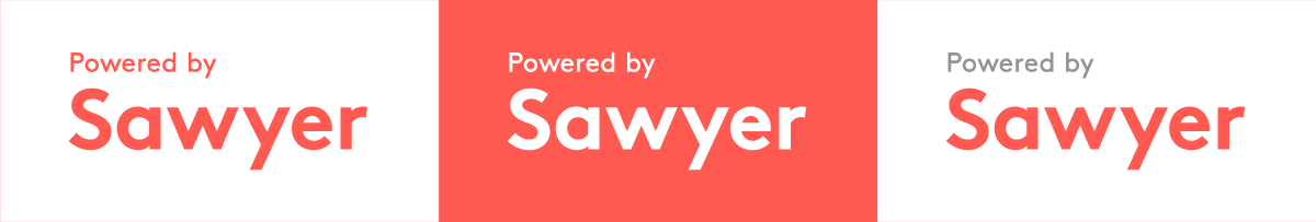
Color and background
The poppy red logo should only be placed on very light backgrounds as shown in the examples below.
If the logo is to be placed on a dark background, we recommend using our poppy red color. If that is not an option, please use a similarly dark color that offers high contrast.
When placing our logo on imagery, the area behind and surrounding the logo should follow the same color guidance and clear space guidance outlined above.
Alterations
The only permitted alteration of our logo is proportional resizing. Any further attempts to alter our logos (including changes to the color, transparency, font, crop, or resolution) are not permitted and must be first approved by the Sawyer Brand Design team.
Motion & video
All above guidance applies to motion and video. Approved animated versions of our logo are available by request. Any additional animations of the Sawyer logo must first be coordinated with the Sawyer Brand Design team.